Harmony visual identification for an architectural studio.

Concept
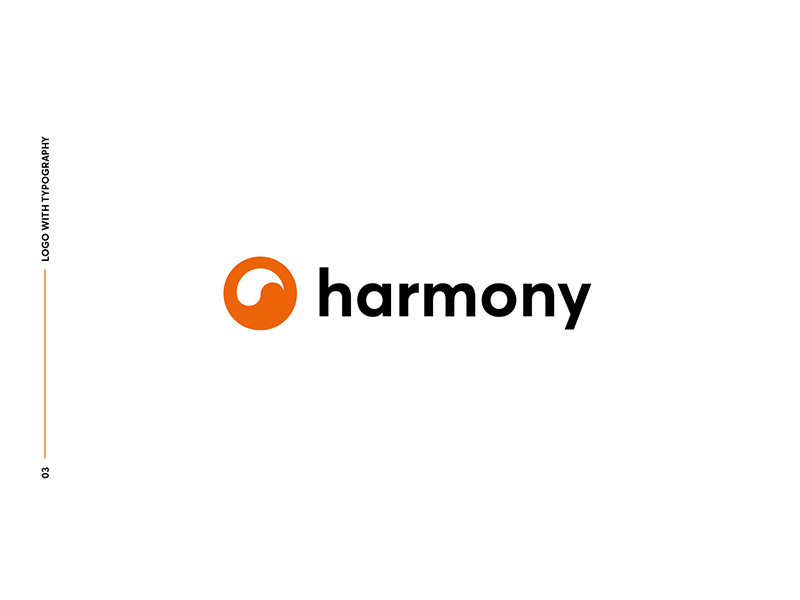
The symbol is the maximum synthesis of shape circle with the symbolu Yin Yang accent. The purpose of the mark was to create harmonious communication that would inspire the trust of customers.
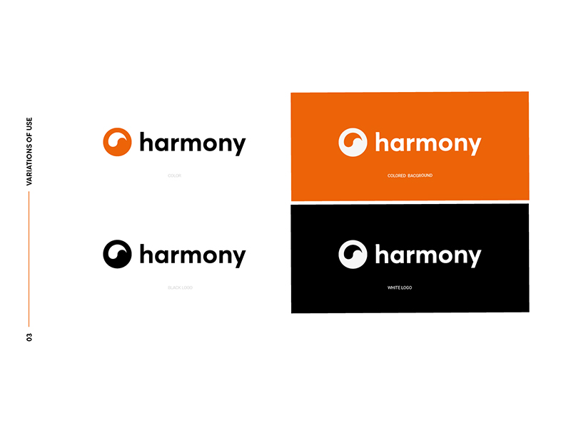
The colors of the sign convey the feelings of a creative approach to interior design. Saturated orange draws attention to the strong nature of the brand.
“Harmony is a beautiful balance between mind, body and soul.”
Melanie Koulouris
Drag


